
Nike Women Berlin — Mailer Box
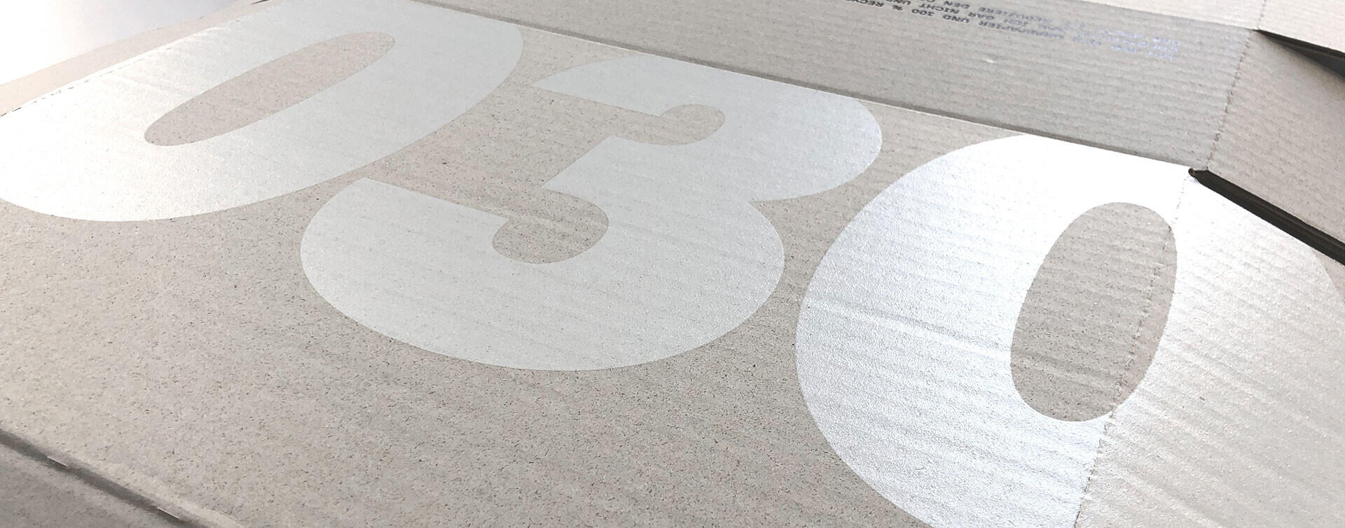
A mailer box is opened once and then usually thrown away — but for an e-commerce order it is often the first physical contact with the brand. It had to feel considered without adding cost, print steps or non-recyclable material.
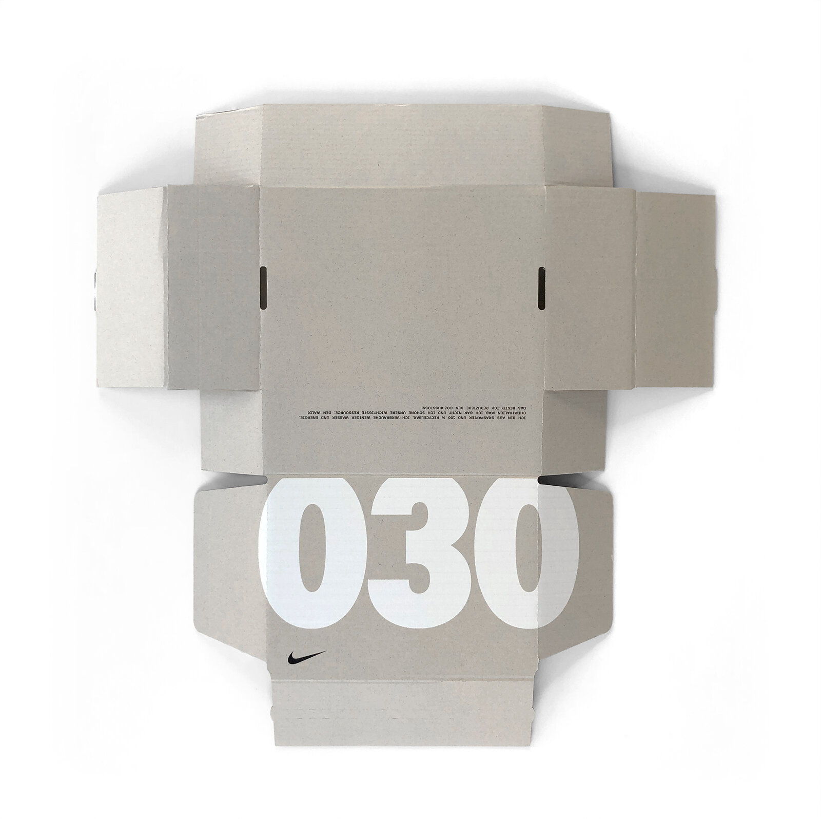
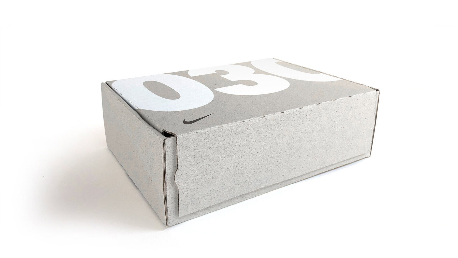
Use the city instead of a new asset. Berlin's own area code, 030, blown up as the dominant graphic on the box - a hyperlocal mark that needed no new artwork licence, no photography, just type at full confidence.
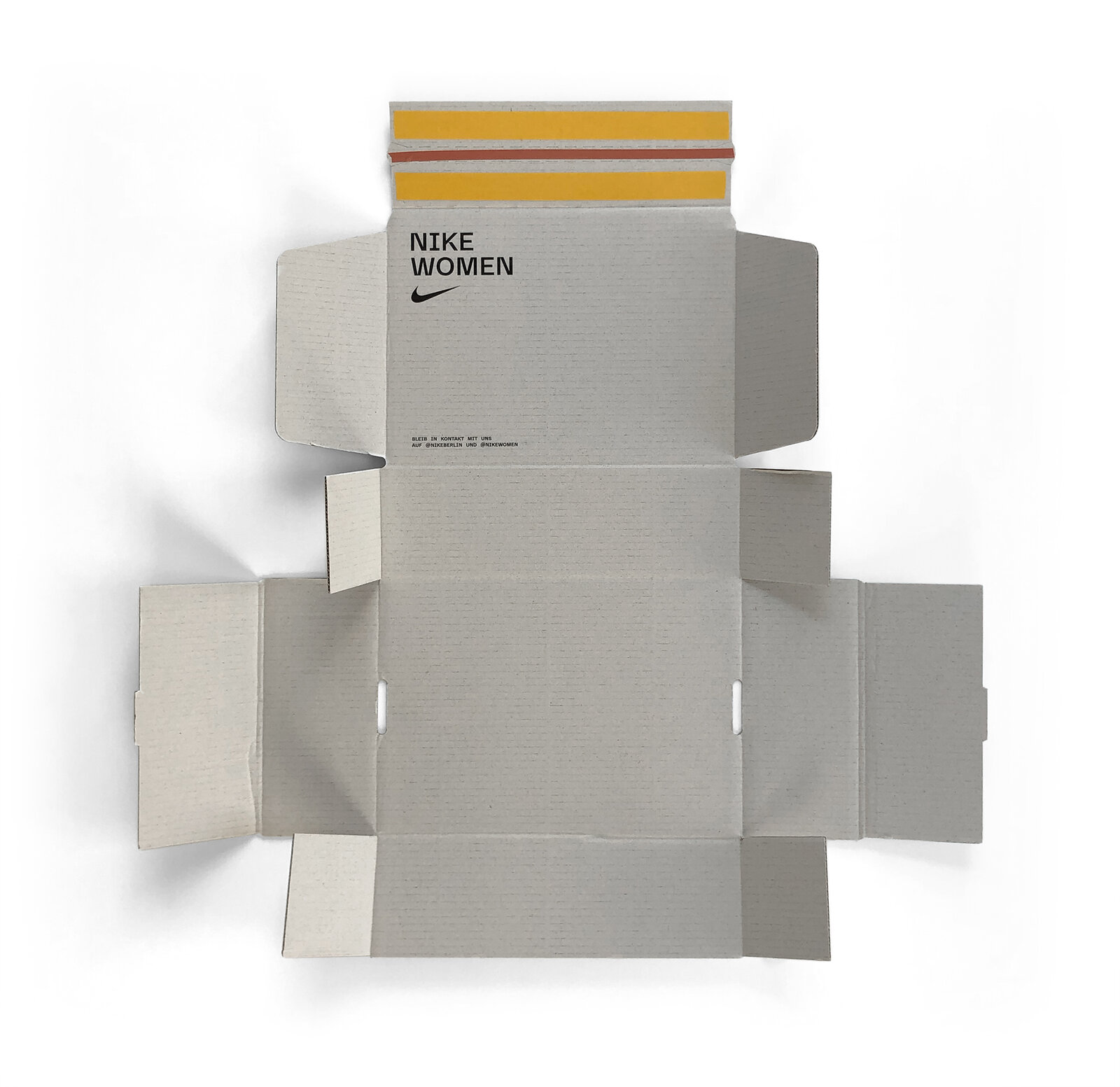
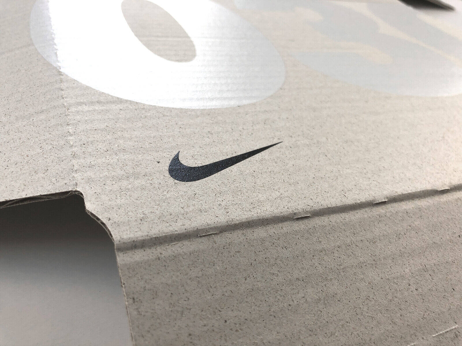
One spot colour (black) on uncoated, undyed recycled board, so the grain of the material stays visible rather than being printed over. Nike Women wordmark and swoosh kept small and quiet; the 030 numerals and the sustainability copy on the reverse do the talking.
Nothing here would change with generative tools - the constraint was never an image problem. Material choice, print process and how ink sits on undyed board are physical questions, resolved with a printer and real proofs, not on screen.
Structural packaging layout, print-ready artwork for uncoated recycled stock, and on-site product photography of the finished box, flat and assembled.
What the approach changed.
No new asset needed
The area code did the identity work a campaign image usually does.
Material stays visible
Single-colour print on undyed board, nothing hidden under a coating.
Sustainability, stated plainly
Recycled content and CO2 savings printed directly on the box.